Flavour that packs a crunch

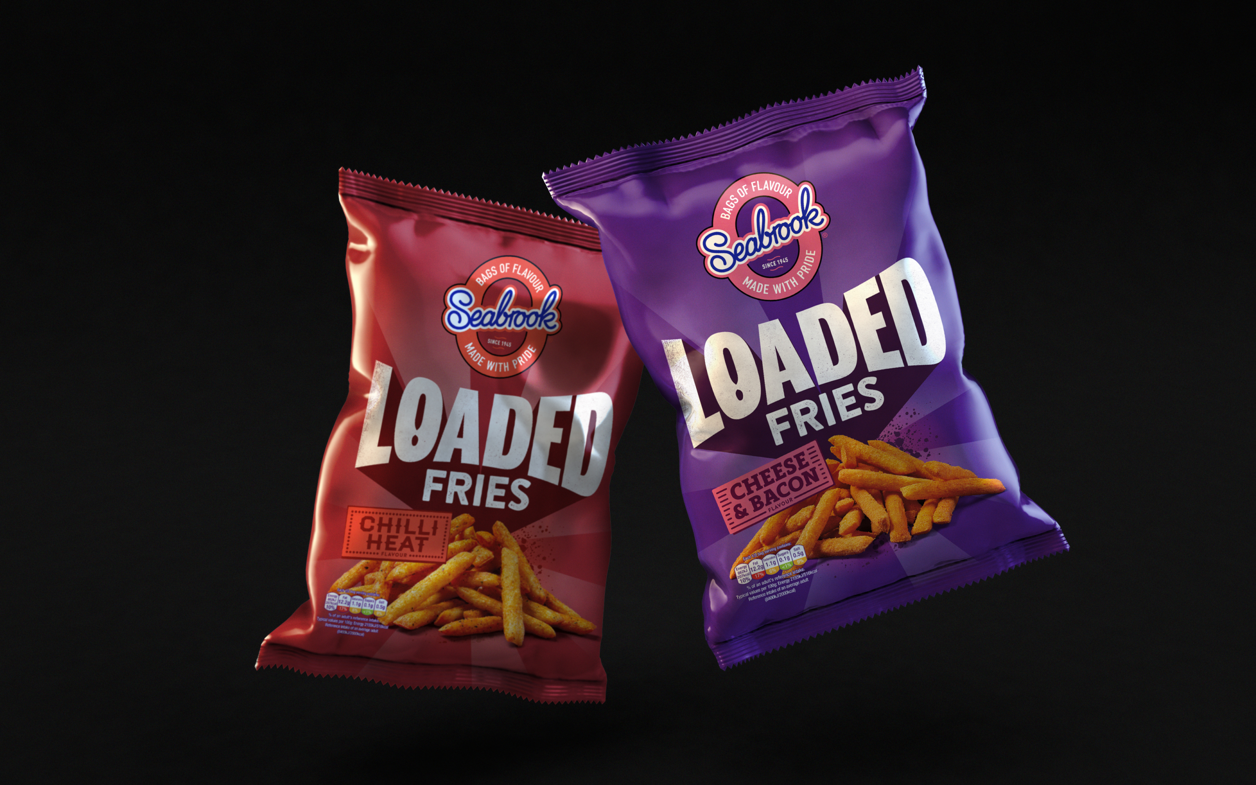
After working with Seabrook to bring crinkle cut crisps to the masses back in 2017, last year we teamed up with the Bradford-based brand once again to create a flavoursome identity for their latest offering, Seabrook Loaded Fries.
The brief was simple – create a bold and energetic sub brand that’s fully loaded with flavour. One that would communicate the street-food inspired proposition, put taste top of the agenda and get snackers’ lips smacking. All whilst sitting comfortably under the Seabrook master brand and allowing freedom for new product development.

We created a look and feel that serves attitude by the heapful, using bold typography for an impactful wordmark complete with a textured spray paint effect inspired by homemade street food signage. Whilst the bright colours and celebratory light bursts add energy and excitement to the identity, helping the snack stand loud and proud on shelf.

Once the design was in the bag, we leveraged Seabrook’s fun-loving tone of voice to create playful product descriptors that celebrate each flavour variation and a brand story that’s guaranteed to get tastebuds tingling.
Pick up a packet from a supermarket near you.
Check out the rebrand we did for Seabrook here.