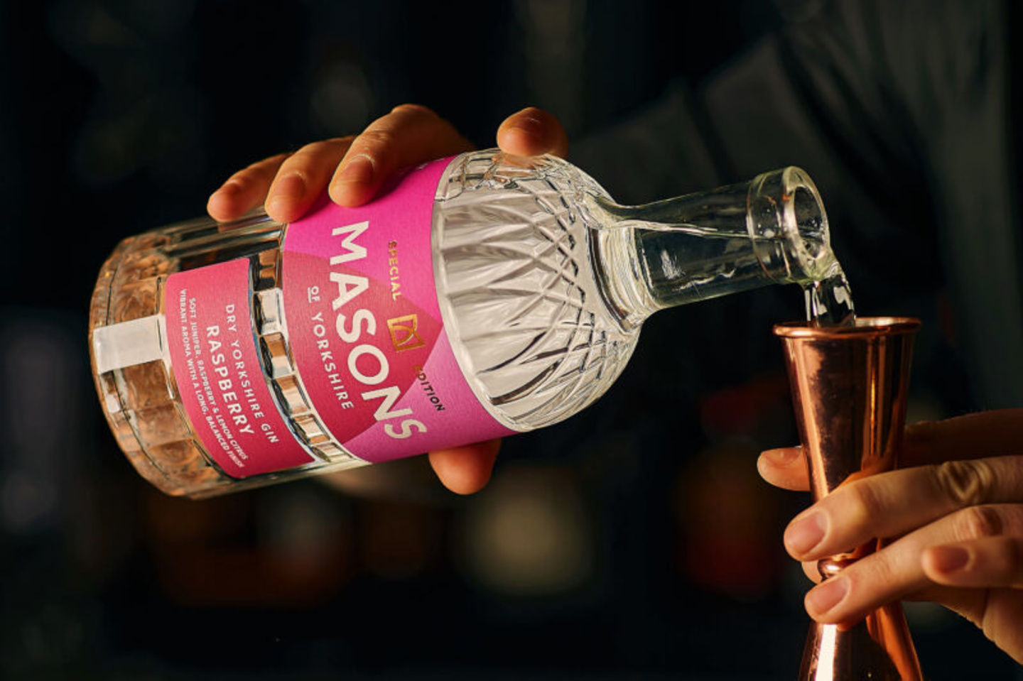
Masons Special Editions

Last year we had the pleasure of working with Yorkshire-based distillery, Masons, on a rebrand – giving them a new identity as distinctive as their gin, including a bespoke bottle. Since then, we’ve been busy creating a design system for their special editions.
Having created a strong brand imprint, it was important that the design wouldn’t deviate significantly from the core range (it still needed to be obviously Masons), but be different enough to elevate and signify something new and exciting. We had to get the balance right.

So, we chose to build on the distinguishable Masons ‘crown’, taking inspiration from the arches in the logo and bottle structure to create a slick, but impactful label design, complete with bold colours and contrasting white foiled word mark.

The first Special Edition to launch is raspberry. You can get your hands on a bottle from their website – and just in time for Valentine’s too.