Redefining a global icon
What we did:
- Creative Strategy
- Visual Identity
- Brand Guidelines
The Brief
We need clarity, but don’t want to lose our creativity and individuality. Can you help?
The Insight
Brooklyn’s fans have always resonated with the bold attitude and eclectic visual style they’re famous for.
But over time as new beers have been introduced with new brand marks, the identity had got watered down which has made it hard for new customers to navigate.
The idea
Champion Brooklyn’s ‘here’s to difference’ mentality with a consistent, future-proofed design system that celebrates each beer.
We kicked off with an extensive audit of the brand to understand where the difficulties were. And it soon became clear there were a whole host of growing pains, across both their local and international touchpoints.

Adding new formats and SKUs for new markets had watered down the identity and it was full of inconsistencies, with multiple brand marks and treatments in play and no real clarity on what the ‘master’ brand should look like.
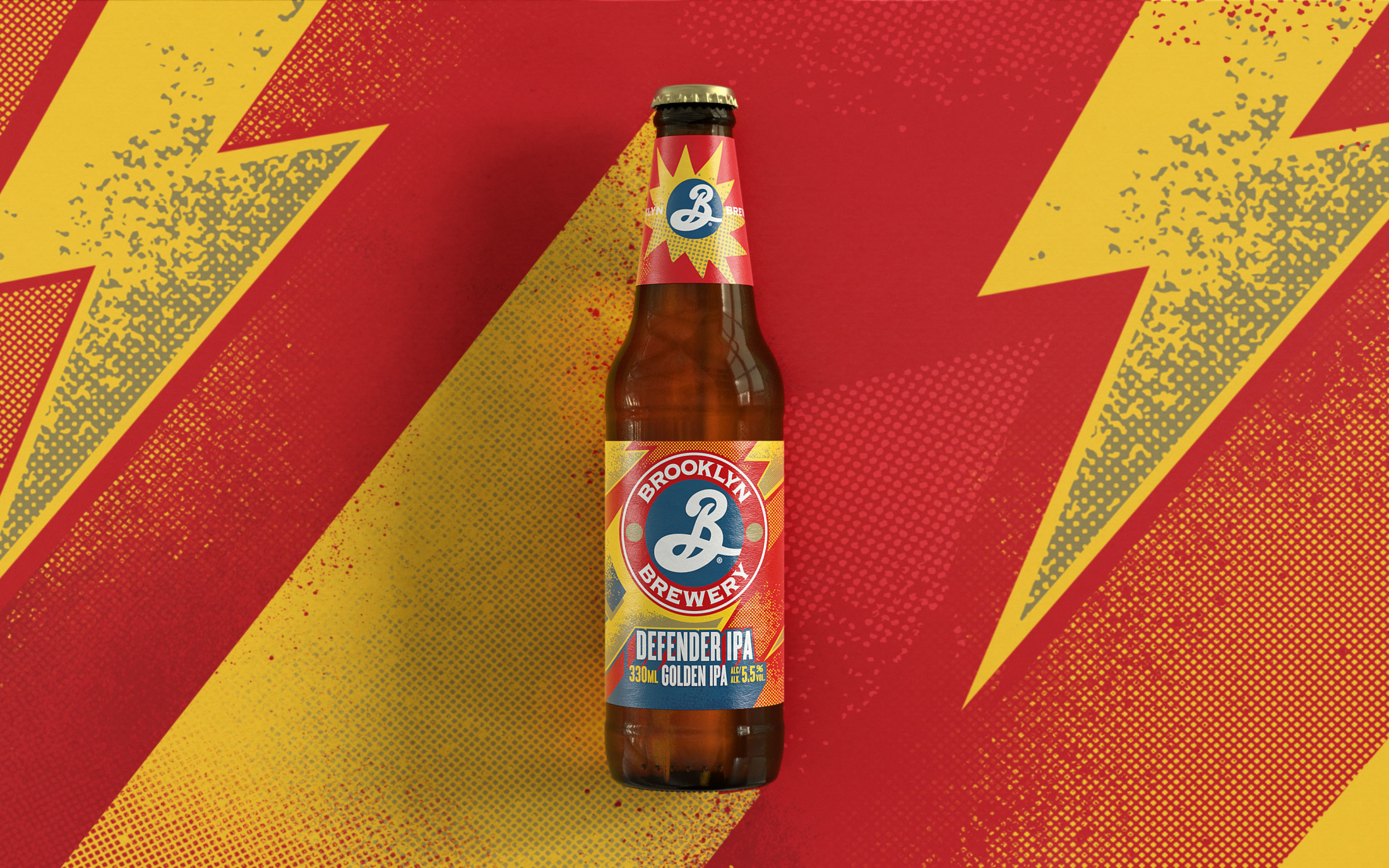
We consolidated the various versions of the brand mark to create one simple, consistent brand imprint that’s proudly and recognisably Brooklyn Brewery.


“Brooklyn’s iconic logo, created by design legend Milton Glaser, is integral to the brand’s history, so it was important we keep the essence of it there, whilst making the necessary changes to build a bolder brand imprint.”
Ben
Creative Director

We developed a clear pack architecture to make the brand easier to spot and the beers easier to shop, whilst celebrating the different personalities of each distinct brew.


“Global brands bring lots of global challenges – multiple stakeholders, regional regulations, different print specs. So this project wasn’t just about simplifying and amplifying the design, but streamlining the whole process to get the best result.”
Dave
Managing Director


The design is now unified across multipacks and all other key sales formats for better recognition and shelf stand out.


Limited Editions
We equipped Brooklyn with a clear template for limited release brews to build excitement and add a feeling of collectibility, whilst maintaining a strong sense of identity.

“If you want a progressive agency partner with a global perspective, Robot Food are it. From Brooklyn to Leeds, the team didn’t let distance get in the way. They listened to us, challenged us and made navigating our complex internal processes look easy.”
Peter Barwick
Global Head of Design — Carlsberg Group


