Making a Brit classic a global icon
What we did:
- Creative Strategy
- Visual Identity
- Art Direction
The Brief
Help us introduce ourselves to a whole new audience of millennials in the US and Australia as the go-to treat of choice.
The Insight
Mr Kipling might be a household name at home in the UK, but across the pond, not so much. When a lack of preconceptions means nostalgia won’t cut it, consumers need to be convinced that the product will take the cake.
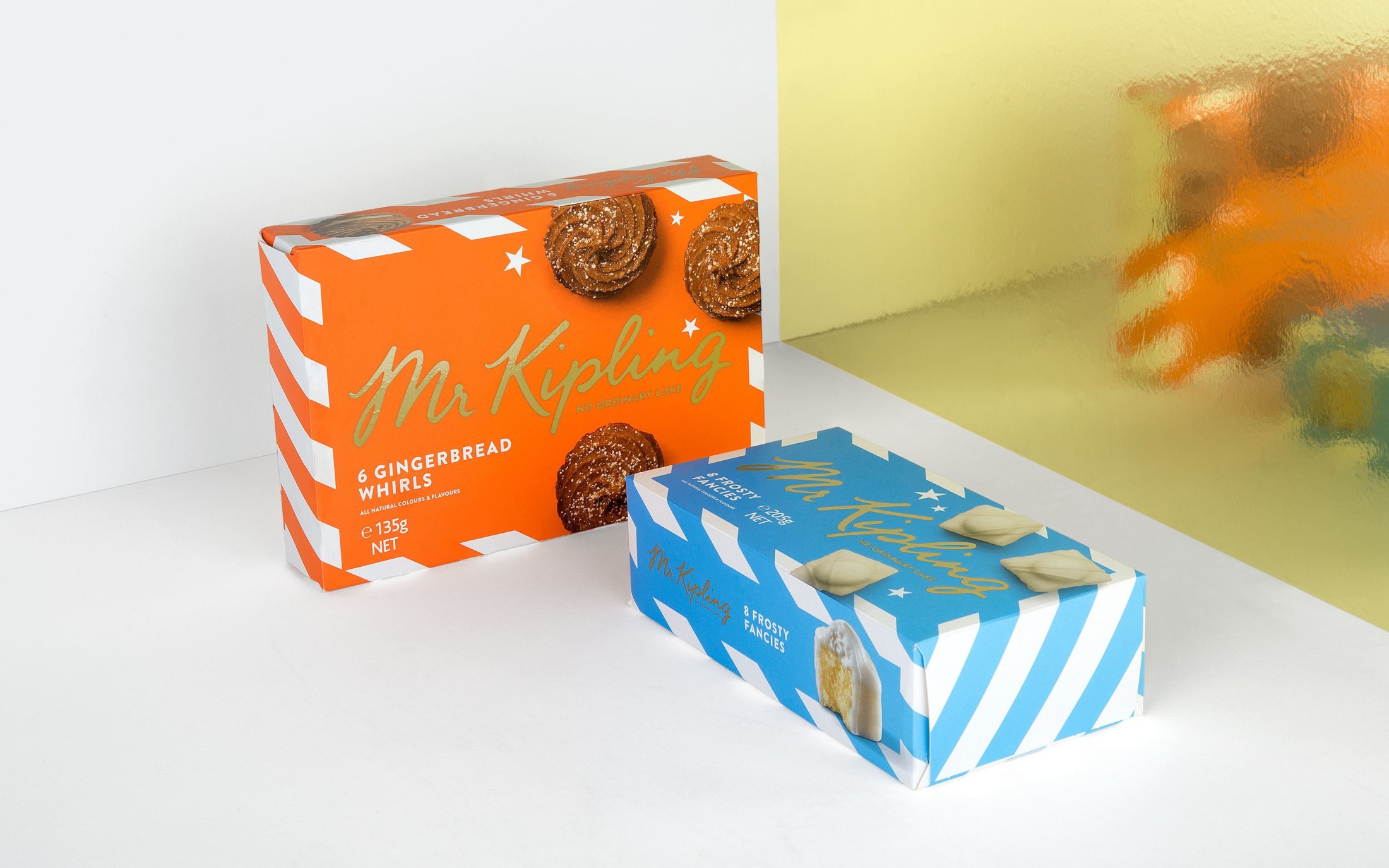
The idea
A modern take on cake that puts product centre stage.
For the front of pack, we focused on establishing Mr Kipling’s creations as icons in their own right, backed up by a strong and simple brand mark.


Inspired by the patisseries of Europe, we went for bright pastel colours for a fresh and contemporary feel.


Mr Kipling could compete on quality in both markets, so we chose to showcase the delicious bakes on the front of pack, accompanied by shots of prominent ingredients where we could.

“The idea was to create an elegant look and feel, without going overly ornate. The packaging needed to stand out on shelf and be easy to interpret at first glance, while celebrating the quality and deliciousness of the bakes.”
Simon
Founder & ECD


For seasonal products, we ramped up the personality – introducing a different photography style and seasonal design elements to give a clear point of difference to the year round range.