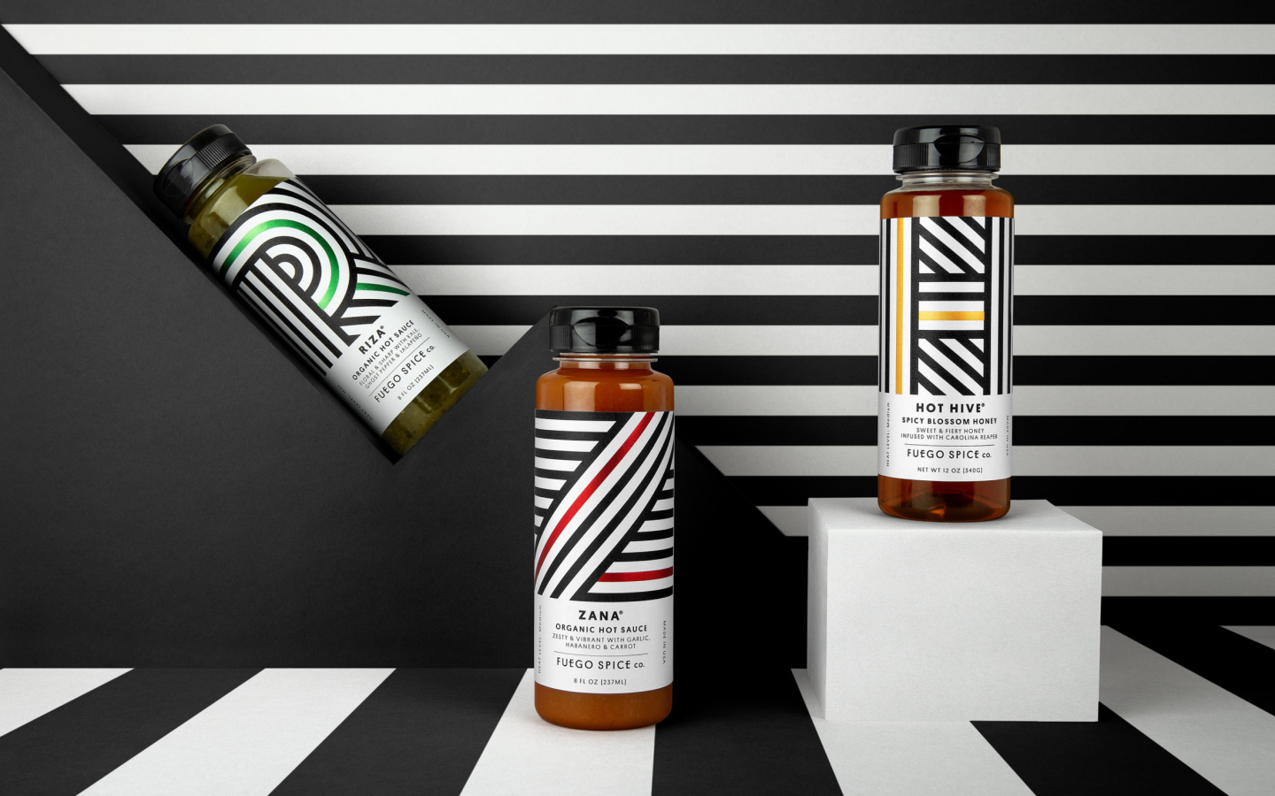
Putting flavour over fire

What we did:
- Creative Strategy
- Visual Identity
The Brief
We need a rebrand to bring flavour to the forefront of our delicious range of hot sauces and Hot Hive honey.
The Insight
Heat isn’t everything. Real hot sauce lovers don’t just want something that blows their head off, they’re looking for flavour that’ll tantalise their tastebuds too.
The idea
‘Not-your-average’ hot sauce. Bring some unexpected sophistication where novelty normally rules.
A massive category in America, sprawling hot sauce shelves are packed with novelty bottles that are all jostling for the top spot on the heat scale.
“We moved away from the gimmicky style of the category and instead took inspiration from premium lifestyle products to create a brand that would look as good on the table as it tastes on your food.”
Chris
Design Director


We unified the range under one visual umbrella, harnessing bold, abstract lettering to identify each sauce, along with metallic foils, which are set off by a matte white background.

We also created a clearer visual hierarchy for the packaging, making the master brand more prominent and filtering the key information down into tasty flavour profiles.

For the messaging, we created a no-nonsense pack story that flies the flag for flavour over fire.


